Evaluating the Tribunals Ontario Website
Gathering and incorporating user feedback on Tribunals Ontario's new website before their projected September 2024 launch.
My Role
Researcher
Team
Project Lead and myself
Timeline
June - August 2024
Tools
Miro, Alchemer, Zoom

Project overview
Goal
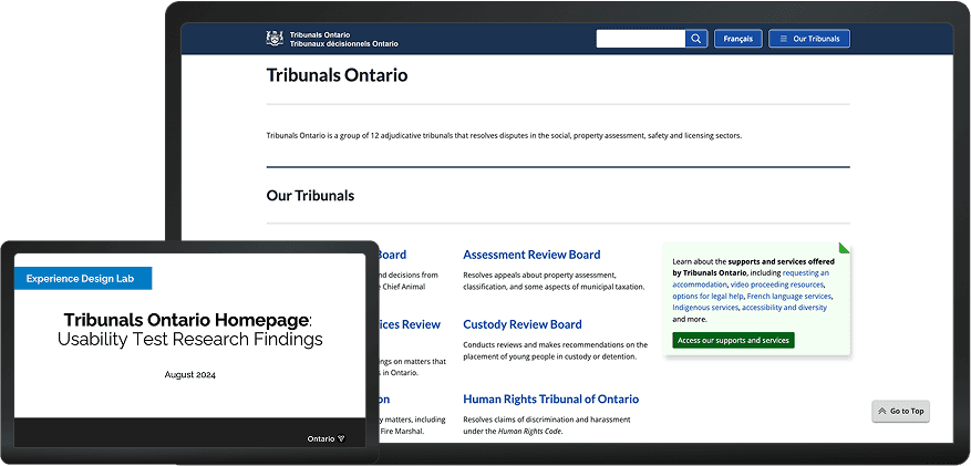
The Tribunals Ontario communications unit modified existing website content to enhance the online experience for users navigating tribunal services, boards and commissions. Goals included intuitive navigation, a clear portrayal of the application process, and to remove accessibility barriers.
Approach
I ran usability tests with past Tribunal applicants as well as internal Tribunals Ontario call centre staff to understand how the website might best meet both user groups' needs.
View the live redesigned site
Research process
Stakeholder alignment
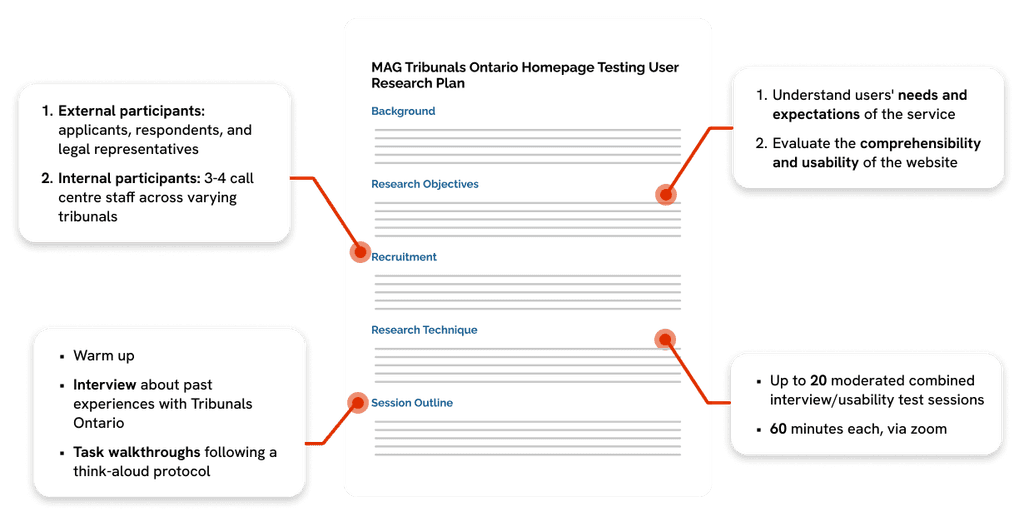
Background research, stakeholder workshop, user research plan
Recruitment
Screener design, participant selection, session scheduling
Developing materials
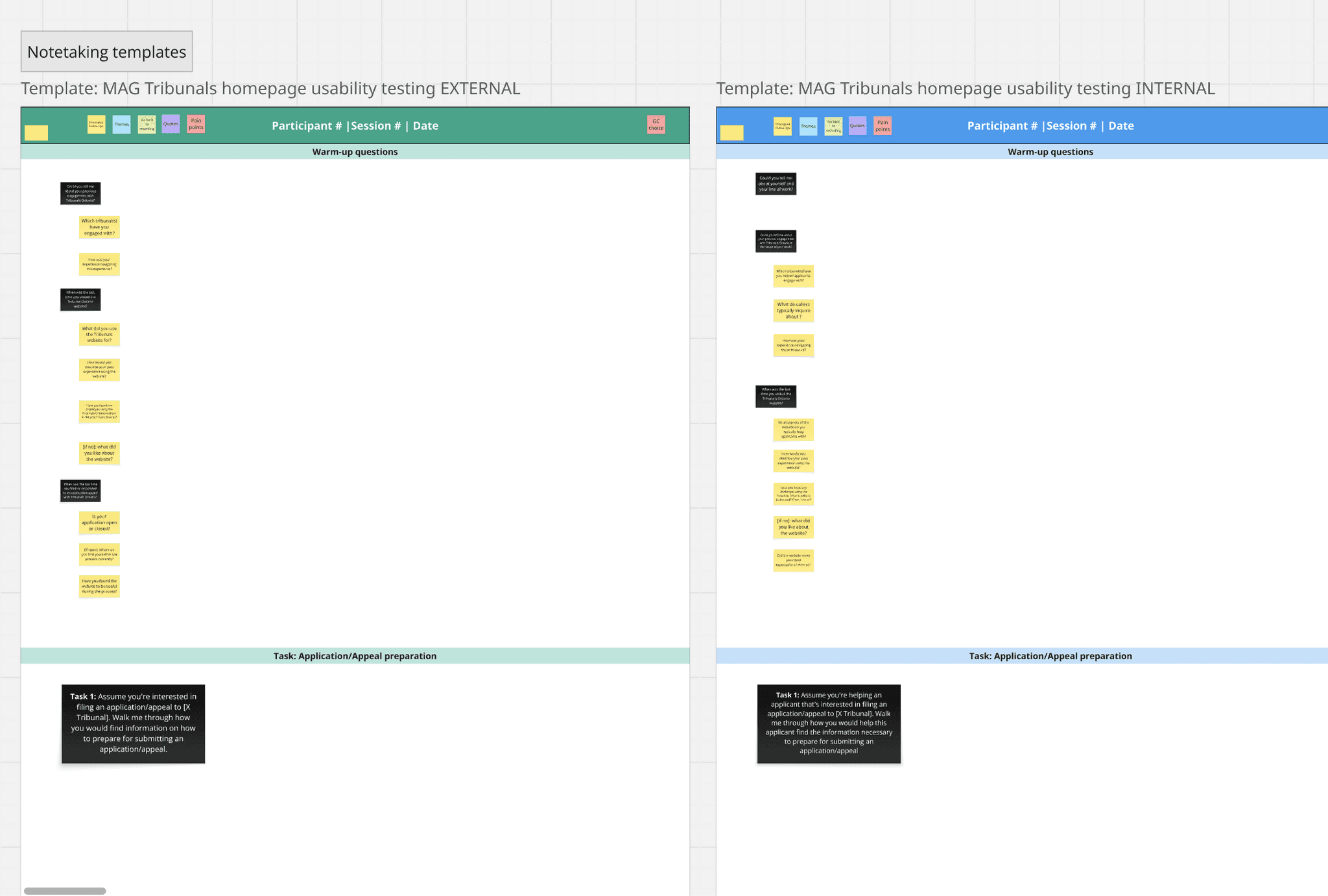
Facilitation guides, note-taking templates
Running sessions
Participant consent, transcription, data cleaning
Data analysis
Thematic analysis, insight generation, recommendations
Stakeholder alignment
User research plan
After conducting background research on how the filing process works per tribunal and facilitating a kick-off workshop with Tribunals Ontario, I distilled our research strategy in a document that held our team accountable in our methods and outputs.
Recruitment
Screener design
I drafted the participant screener in Alchemer, utilizing conditional logic. Data from the screener helped our team to determine participant eligibility and ensure:
Target participant numbers per tribunal were met
A mix of participants with open vs. closed applications
General diversity amongst participants across age, sociodemographic variables, confidence with technology and more
Participant selection
Working from an anonymized spreadsheet of screener response data, I selected participants to ensure a diverse and representative user base. I also considered how compatible their availability was with that of our team's schedule.
Internal participants:
5 call centre staff
Landlord and Tenant Board (3)
License Appeal Tribunal (1)
Fire Safety Commission (1)
External participants:
2 support roles
Landlord and Tenant (1)
Assessment Review Board (1)
3 applicants
License Appeal Tribunal (3)
Human Rights Tribunal (5)
Assessment Review Board (1)
3 legal representatives
Landlord and Tenant Board (1)
Human Rights Tribunal (1)
Assessment Review Board (1)
Developing materials
Facilitation guides and note-taking templates
In preparation for conducting user sessions, our team wrote facilitation guides that detailed questions we'd ask participants, as well as possible follow-ups depending on the question. I converted these guides into note-taking templates in Miro, to easily take notes during user sessions.
Data Analysis
Thematic Analysis
After cleaning user session notes, thematic analysis involved summarizing session notes and grouping them according to themes our team aligned on. Summaries were tagged with participant numbers and user group so that they could be easily traceable to user sessions notes. Our findings fell into three themes:
Navigation
How users found their way around the Tribunals Ontario website.
Content
How users responded to the information presented on the Tribunals Ontario website.
Forms
How users found and responded to form-related content.
Key Findings
Navigation
Finding:
Recommendation:
Key information hidden
Users found key information difficult to spot in dense paragraphs of text, including links, timelines, and contact information. They desired fewer clicks to reach this information and more experienced users desired shortcuts.
Revise site IA
Increase the prominence of contact and timeline information by highlighting it at the top of pages, and increase link visibility through bolding and underlining.
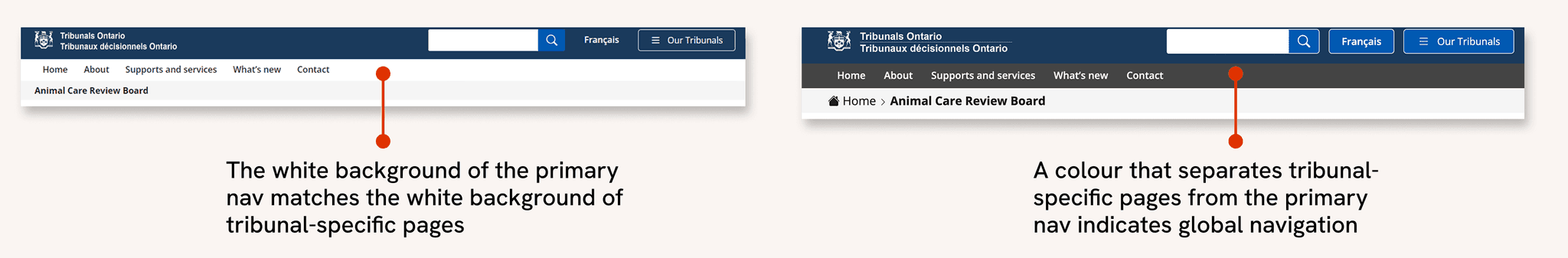
Two navigation streams
Poor distinction between global nav and site pages
Users expected the global navigation to relate to their tribunal of interest and were surprised when it didn’t. They expected the same of the search bar, desiring results specific to a single tribunal.
In-page navigation
Add local, in-tribunal navigation instead of relying on embedded links to pages. Consider a side nav that is easily distinguishable from the global navigation.
Visual separation
Create visual separation between the global navigation and site pages via different navbar colours so as to not confuse the two.
Content
Finding:
Recommendation:
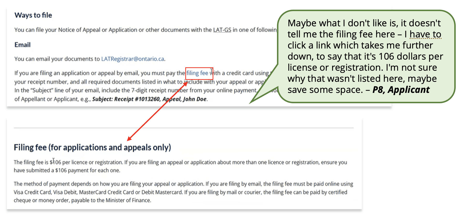
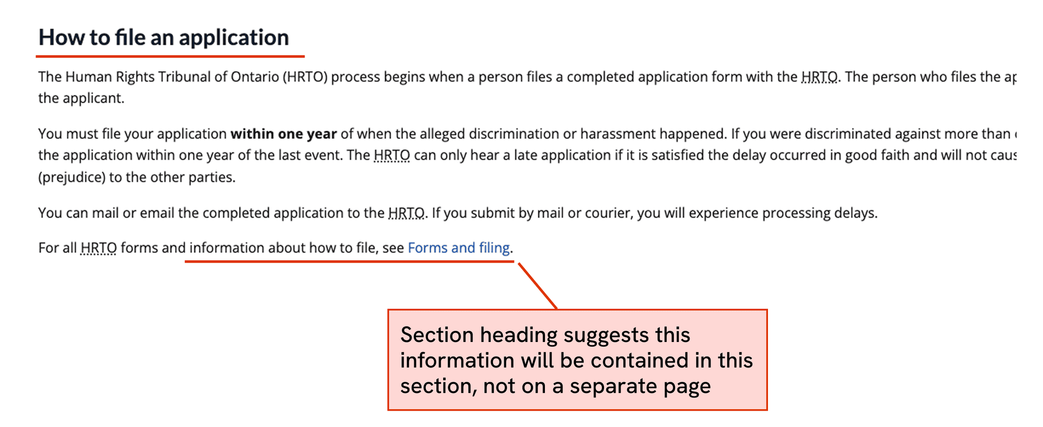
Information is not where users expect
Users often struggled to find information where they expected, instead finding it scattered across external PDF guides, forms, and headings. This was especially true for information on submitting applications.
Improve content language
Rename some page headings to better describe their content. Add brief descriptions of what to expect on a hyperlinked page before users enter it.
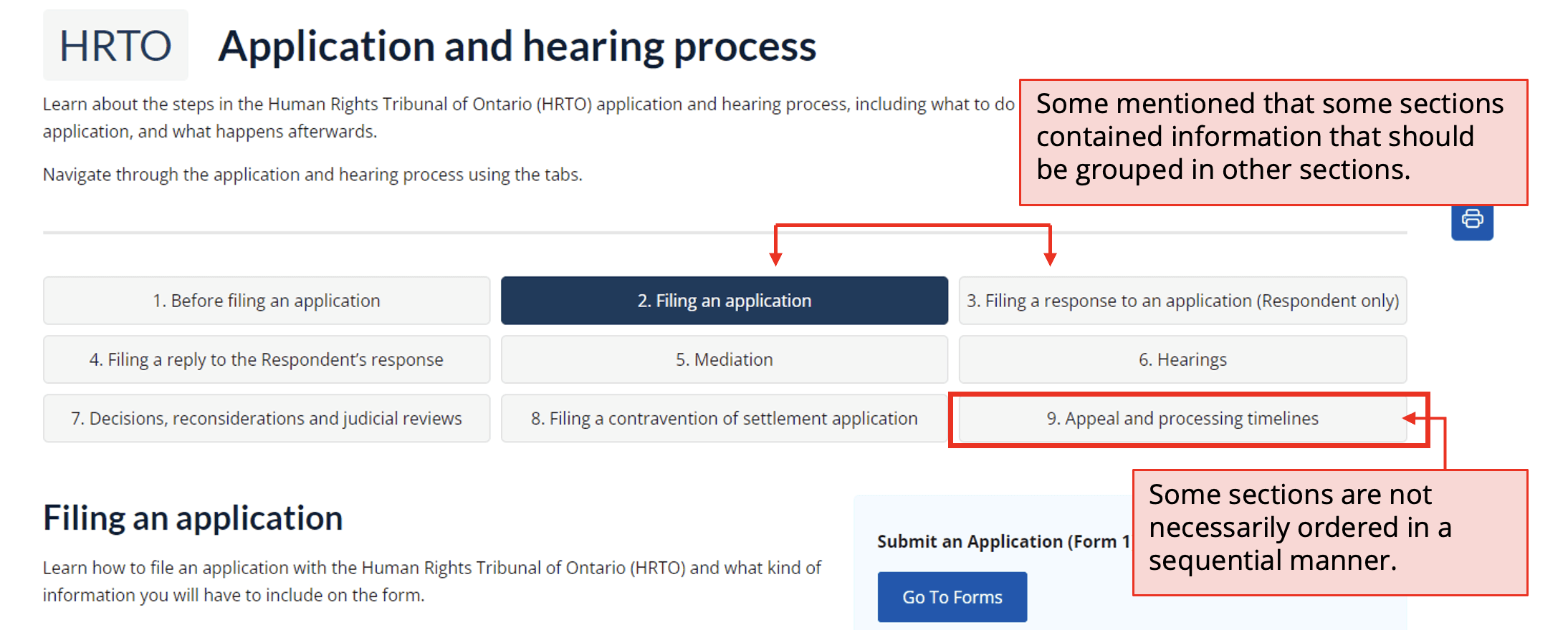
Process step confusion
Users struggled to understand the filing process steps, which are represented as numerical tabs. They assumed the tabs followed a sequential order and functioned as a tutorial-style guide, when in reality they function as a table of contents.
Paginated displays
Display process step information through paginated displays that indicate the next step of the process promptly.
Forms
Finding:
Recommendation:
Difficulty navigating to forms
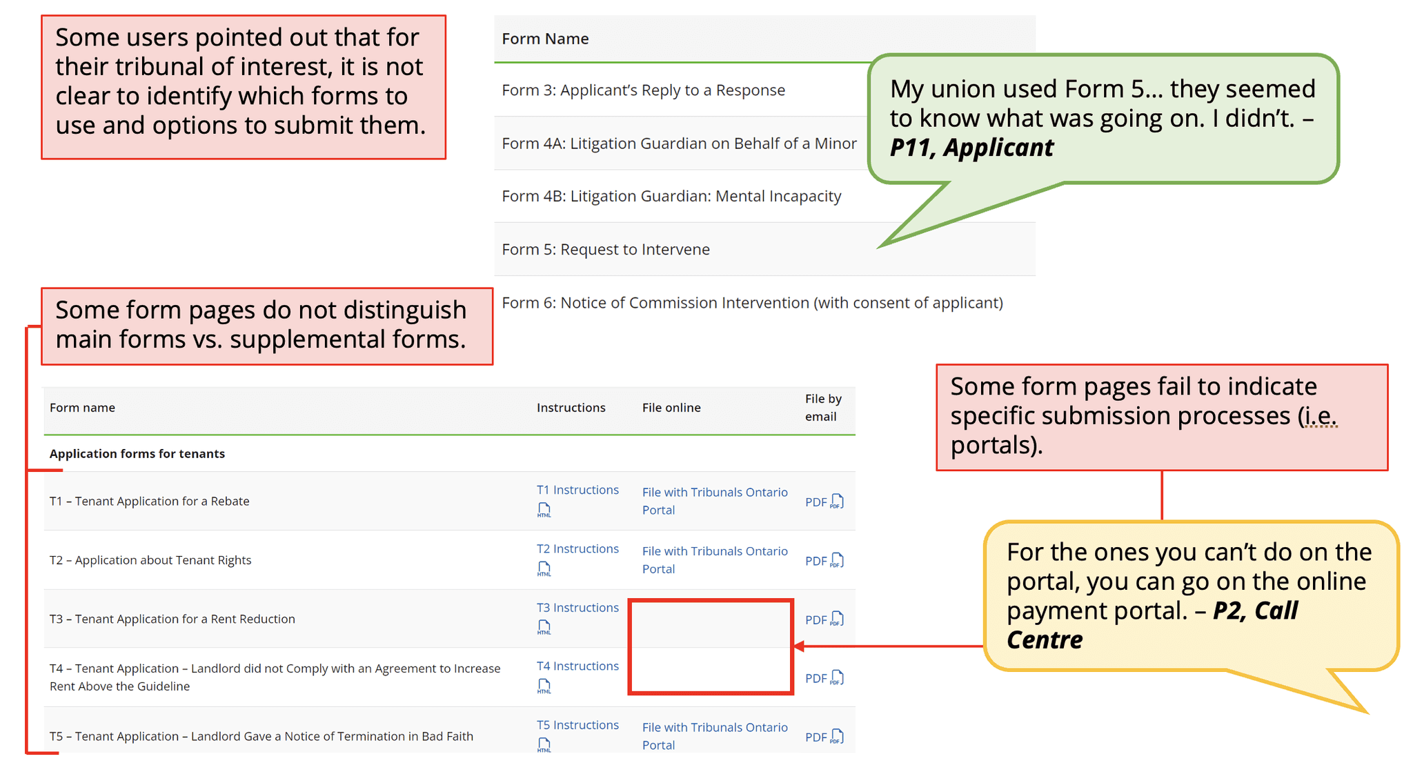
Users had difficulty navigating to application and appeal forms, which is a crucial function of the site. Users often noticed to reference to forms without explicit redirection to them.
Centralize access to forms
Centralize all form and filing information onto the same page/sub-section.
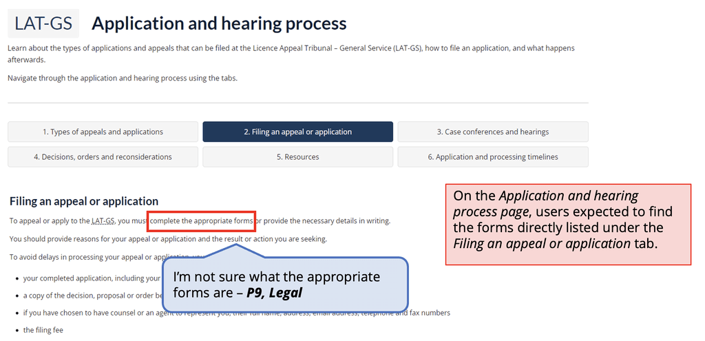
Difficulty identifying correct forms
Several participants pointed out that there is a lack of distinction between forms, making it difficult to identify which one they need. Some pointed out that that some form names are not descriptive enough (i.e., Form 1 and 1G).
Improve form descriptions
Rename forms across all Tribunals to make them more distinctive from one another. Consider adding descriptions for each form, and separate supplementary forms from standard forms.
Next steps
Content review
When presenting our findings to the TO communications team, we recommended conducting an in-depth content review to identify outdated or otherwise irrelevant content, as well as to prioritize plain language and digestible information.
Iterative improvements
Since my involvement in the project, Tribunals Ontario has gone on to make revisions to site layout and content in line with our recommendations, some of which are reflected in the current live site. The website will continue to undergo changes through an iterative process.
View the live redesigned site
My takeaways
An exercise in communication
A number of constraints resulted in our impact being limited to recommendations without mockups to illustrate them. Though not ideal, it tested our ability to effectively communicate detailed and nuanced insights with minimal visual support. Without our own mockups, we turned to trusted sources such as Ontario's own design system and GOV.UK's design system to showcase examples of alternative layouts, components and styles that might help the TO team achieve their goals.
Section heading suggests this information will be contained in this section, not on a separate page.